I’ve recently completed my first javascript data visualization project at The Sentinel Project for Genocide Prevention to develop a dashboard that tracks indicators of hate crime in Iran.
You can take a look here:
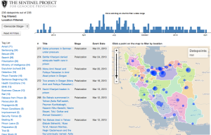
http://threatwiki.thesentinelproject.org/iranvisualization
Initial requirement
I had a set of data coming from a JSON REST API and I wanted to show the main data in a table, display the geographical coordinates of the data on a map and be able to filter by date and tags.
Technology choices
I chose Crossfilter to be able to filter through the data, D3.js to generate/display all the data and the map itself is created with leaflet.js
Implementation details
For the map generated with leaflet.js, I used CloudMade (which I highly recommend) to get maps from OpenStreetMaps. I added a layer on top of the map to show different regions of the country, which was coming from Natural Earth shapefiles and converted to data with TopoJson and added on the map with D3. Leaflet turned out to be a great tool that I will definitely use again, I used the D3 + Leaflet tutorial from Mike Bostock to learn how to combine the 2 tools together. To add the datapoints at specific locations on the map, I used the marker functionality of Leaflet. I started adding the datapoints manually on the map by generating the proper svg tags with D3 on the canvas but I switched to markers because this will allow me later to integrate with LeafLet Market Cluster. This Leaflet plugin gives you the possibility of combining multiple closely located points on a map, which becomes useful when you have a high concentration of points in a a small region that are hard to distinguish at the normal zoom level. This other tutorial Let’s make a map by Mike Bostock also come handy when working with D3 and maps.
There was a good learning curve necessary to understand D3.js. Reading code from examples is not always enough, I had to read about the core concepts and the introduction available on their github wiki. However, once you understand the concept, you realize that this is a very powerful tool to generate all kind of visualization either visually (in a canvas using SVG) or just displaying a set of data as text.
To be able to filter by tags, date, and other metadata, I used Crossfilter, a open-source library developed by Square. To learn about Crossfilter, I used this excellent example on their website. I used their example code to create the visual bar chart that is used as a timeline. There is also a great tutorial on the Wealthfront Engineering blog that really helped me to understand the concepts of the library. Crossfilter was definitely easier to grasp and understand. The most recent version of the tool, 1.2.0., released just a few days ago, is definitely necessary. They introduced the concept of filterFunction, to give you more control on how you filter your data.
For a typical filtering in Crossfilter, you only provide the object to the filter function of a chosen dimension and Crossfilter will do the filtering. You need to implement a filter function when your data structure gets more complex. Let’s say you have a record that can have one or multiple tags. If you only filter by giving the name of a tag, you will only get back the records that contain very specifically only this 1 tag and ignore all the records that have this tag combined with other tags.
So you want to implement a filterFunction like this:
window.filter = function(tagname) {
 byTags.filterFunction(function (tag) {
  if (tag!==null && typeof(tag)!='undefined'){
   for(i=0; i<tag.length; i++) {
    if (tag[i].title==tagname){
     return true;
    }
   }
  }
  return false;
 });
}
In that case we will go through our array of tag inside the record and return true to the filter at the moment we find the matching tag inside the array, so it wouldn’t matter if we have 1 tag or 10 tags on that record.
To learn more and get involved
If you are interested to look at the code, our project is hosted on Github. You can also look directly at the visualization javascript file. The data for this project is free of access to anyone who wants it, drop me an email if you need information on that.
That visualization for The Sentinel Project for Genocide Prevention has been announced on their blog.
If you have some experience with data visualization, maps, GIS or you just are a data nerd send me an email, we have lots of interesting projects coming up!
